Baltimore, MA
Environmental Justice: Redlining
Human Health & the Environment
Tue Sep 2, 2025
Human Health & the Environment - Tue Sep 2, 2025
Environmental Justice: Redlining
The New Deal
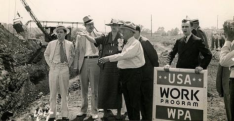
FDR established the Home Owners’ Loan Corporation in 1933 to help homeowners who were at risk of losing their homes to foreclosure
They primarily designed the program to provide housing to white, middle-class, lower-middle-class families
- African-Americans and other people of color were left out of the new suburban communities — and pushed instead into urban housing projects.
The Federal Housing Administration
established through the National Housing Act of 1934
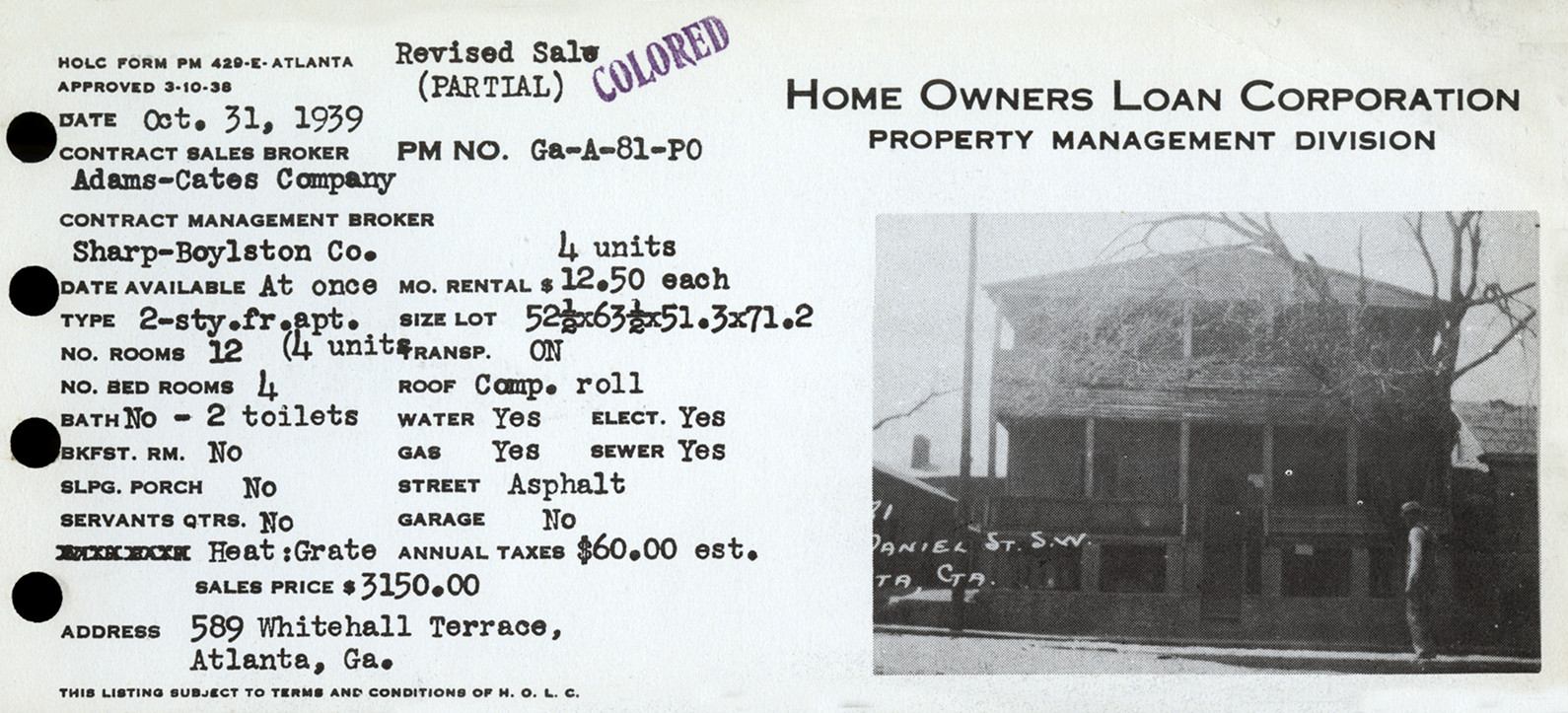
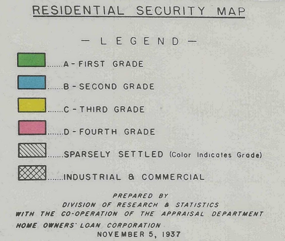
- Maps of every metropolitan area in the country
- Color-coded by where it was safe to insure mortgages
- African-American neighborhoods usually rated with the highest risk (colored red)
- Color-coded by where it was safe to insure mortgages
The Federal Housing Administration
“Incompatible racial groups should not be permitted to live in the same communities.” – Underwriting Manual, the Federal Housing Administration
- The FHA subsidized builders who were mass-producing entire subdivisions for whites
- The Underwriting Manual of the FHA explicitly forbid racial minorities from living in those communities
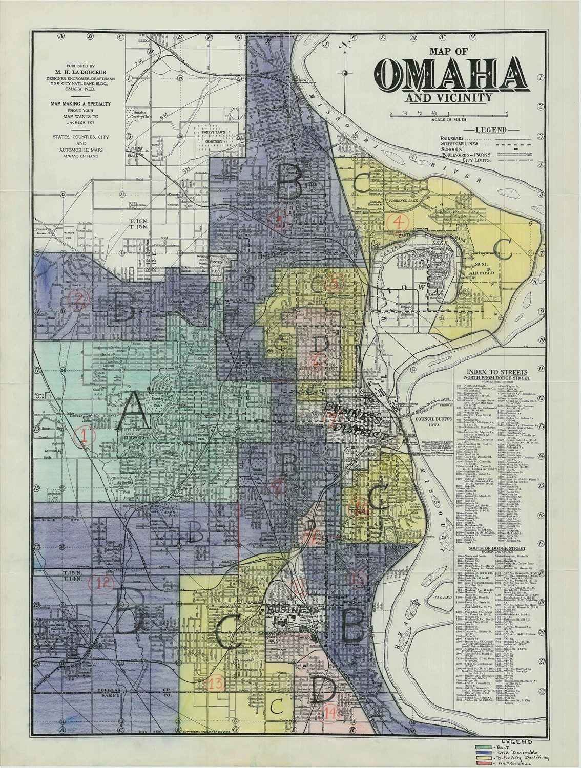
Omaha’s History
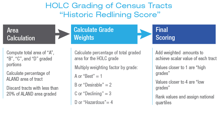
National Community Reinvestment Coalition
- The National Community Reinvestment Coalition investigated the HOLC’s lasting impact across 12,833 US Census tracts
- Compared their recent social and economic conditions with city-level measures of segregation and economic inequality
Key Findings
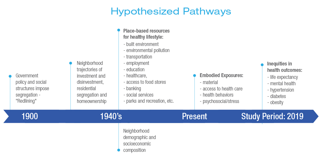
- Greater historic redlining is related to current neighborhood characteristics, including increased minority presence, higher prevalence of poverty and greater social vulnerability.
- There are statistically significant associations between greater redlining and general indicators of population health, including increased prevalence of poor mental health and lower life expectancy at birth.
Key Findings
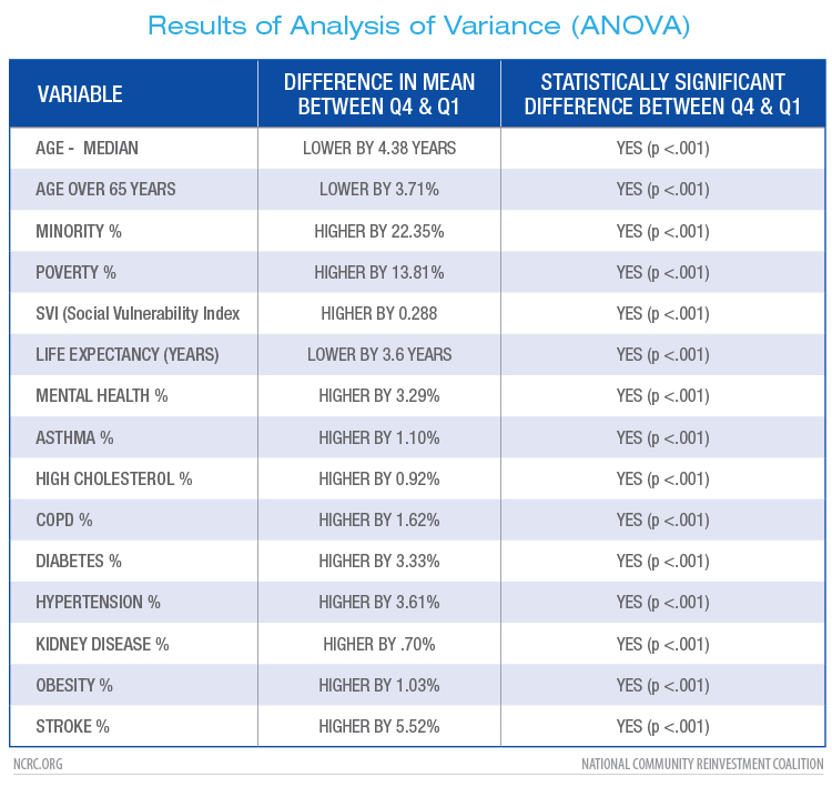
- There are statistically significant associations between greater redlining and pre-existing conditions for heightened risk of morbidity in COVID-19 patients like asthma, COPD, diabetes, hypertension, high cholesterol, kidney disease, obesity and stroke.
- Differences in life expectancy vary greatly among cities: from 14.7 years less in redlined neighborhoods of Rochester, Minnesota, to a 1.3 year greater life expectancy in redlined neighborhoods of Ogden, Utah, which has experienced considerable growth and urban development since 1940.
Omaha’s Redlining Legacy
Scan to open on your device:
Discussion
Scan to open on your device:
Discuss the following questions in small groups first and then as a class:
- Do you see areas with a high “health vulnerability” score today that were once rated “D” (hazardous) on redlining maps?
- What about areas with lower vulnerability now that were “A” or “B”?
- How might redlining policies from the 1930s still influence health outcomes a neighborhood today?
Discussion
Scan to open on your device:
Discuss the following questions in small groups first and then as a class:
- Based on the map, where do you think people might have more or fewer healthcare options (clinics, hospitals, pharmacies)?
- If you were proposing a public health study on one of these neighborhoods, what health risk(s) or chronic illness(es) might you want to investigate first, and why?
- If you were a public health official in this city, which two neighborhoods would you prioritize for intervention?
- What specific strategies would you consider (e.g., environmental cleanup, healthcare investment, housing programs)?
Final Discussion
How does seeing the map make you think differently about the relationship between “place” and “health”?